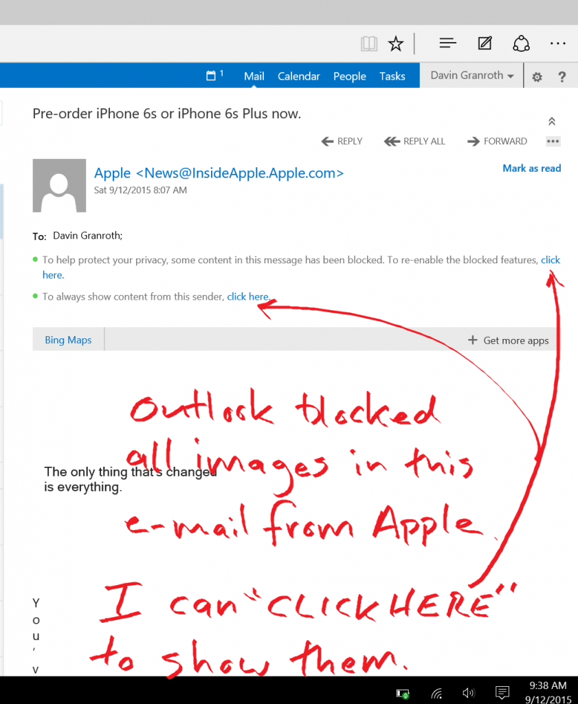
How is it that such poor wording made it into such a major product, here in late 2015?
Basic web writing practices identified the “click here” language as a poor option well over a decade ago. What makes “click here” a bad choice?
One reason is that you end up with a lot of links on a page that all say the same thing (click here), and a common feature in assistive technology like screen readers for blind or visually impaired people is to pull all link text out of page context to give those users a quick way to scan all the links. If they all say “click here,” then a user will have no idea which link to choose.
A second reason is that the link text is highlighted, usually in blue and underlined, and so ought to be meaningful. “Click here” is not meaningful, but the subject or goal of the link sure is.
Here are pretty easy ways to change the language in Outlook.
Instead of “To re-enable to blocked features, click here,” try this:
Re-enable the blocked features.
Instead of “To always show content from this sender, click here,” try this:
Always show content from this sender.

