Presentations this morning
- Threshold of Acceptable Usability
- Neuro Web Design: What Makes Them Click?
- Bringing left-brain and right-brain together (or, the happy spot)
- Anatomy of a bus map
There was an interesting hodge-podge of presentations at the Internet User Experience conference this morning. I suppose, relatively speaking, I’m an old-timer in this field…which is to say I found 1 and 3 sort of boring. I like to think and learn new things. 2 was good, except that I had already studied the book, so it wasn’t new to me. Strangely, the most chaotic and incoherent of the morning sessions, #4, I found the most interesting.

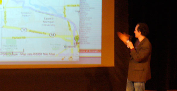
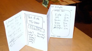
This Vielmetti guy (I have no idea who he is) walked in and so ensued the chaos. He started by asking a room of 150 UXers to fold a prototype of an 8-panel bus schedule. It involved folding and tearing of paper. It was a fun usability exercise (though it wasn’t intended as one). I think I ended up folding it correctly, but didn’t end up needing to tear it? Eh.

His talk rambled fairly well, and included some brief glances at interfaces. Primarily, though, he riffed on stories of people needing to find a way to get on a bus to some other place. For a number of years not long ago, I was a daily user of CATA, the bus system in Lansing, MI, so I appreciated his stories.
One concept that came through his lecture is how the motivations of public organizations (like a public transit authority) have strange—and sometimes missing—intersections with motivation and information expressions of other agencies, such as an apartment management company or customers of the transit system. User motivations, of course, will differ from out-of-town conference attendees versus commuters. Knowledgeable users of a bus system will ultimately know valuable information, or stories, that employees of the bus systems will simply not know. He gave an example of a pedestrian path that services as a shortcut to another bus stop that has buses every 15 minutes, instead of the one that is physically closer but has buses every 30 minutes. Certain expert users know this, but others and the public agency just won’t, and sure won’t capitalize on it.
Small contextualized apps are built often by individuals scratching specific itches, when given the time and free information to manipulate.
I fear this blog post is perhaps as chaotic as the talk. I know I should edit before posting, but…this is, after all, just my personal blog. 😉
By the way, Zach Spencer is also posting lots of notes about the conference on his blog “Life of a Web Programmer.” Here are Zach’s posts tagged with IUE09.

2 responses to “IUE2009: Keynote track”
Davin – thanks for the coherent take on the presentation, which I will freely acknowledge was last-minute engineering and last-minute production.
The fold style I tried is from PocketMod – http://www.pocketmod.com – and I will warn you that there is a small patent minefield to negotiate regarding using that specific fold for tickets.
One of my colleagues who attended as well came to me today and presented his properly cut and folded paper. I realized my take was wrong as soon as I saw his. “I broke the code!” he announced. It’s a pretty cool fold.
I was thinking more about the presentations. In a way, your talk was more free-wheeling…I might call it “live thinking” as opposed to heavily prepped presentations, some of which felt like “dead thinking.”