I was on the phone with Adam and interrupted him because I noticed a commercial that switched fonts from Helvetica Bold in the middle of the spot to Arial Bold in the closing frames. The fonts are so similar that they really shouldn’t have switched. It was probably an oversight, but I was startled by it.
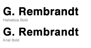
Anyway, Adam commented that it’s crazy I noticed the difference. So, here’s an image to show why it isn’t crazy to notice the difference between the two.

The giveaway for me is the capital letter R. Helvetica’s capital R has some nice curves on the leg of the R, compared to Arial’s fairly angular stroke. I really like Helvetica’s.

3 responses to “Helvetica vs Arial comparison”
Well, I’m going to have to go with Adam on this one. That is crazy that you noticed that.
However, thank you for pointing out Helvetica’s nice curves.
[…] Posted by okalexk in Uncategorized. Leave a Comment I love looking at the ads in Artforum, but I am getting SO SICK of seeing exhibition ads with the same old all-caps sans serif Helvetica or would-be Helvetica. Those stupid curled R kicks drive me nuts! See here and here. […]
These curves of Helvetica… unneeded. It’s kind of an eye-candy that was removed with “Helvetica Neue” nearly completely.