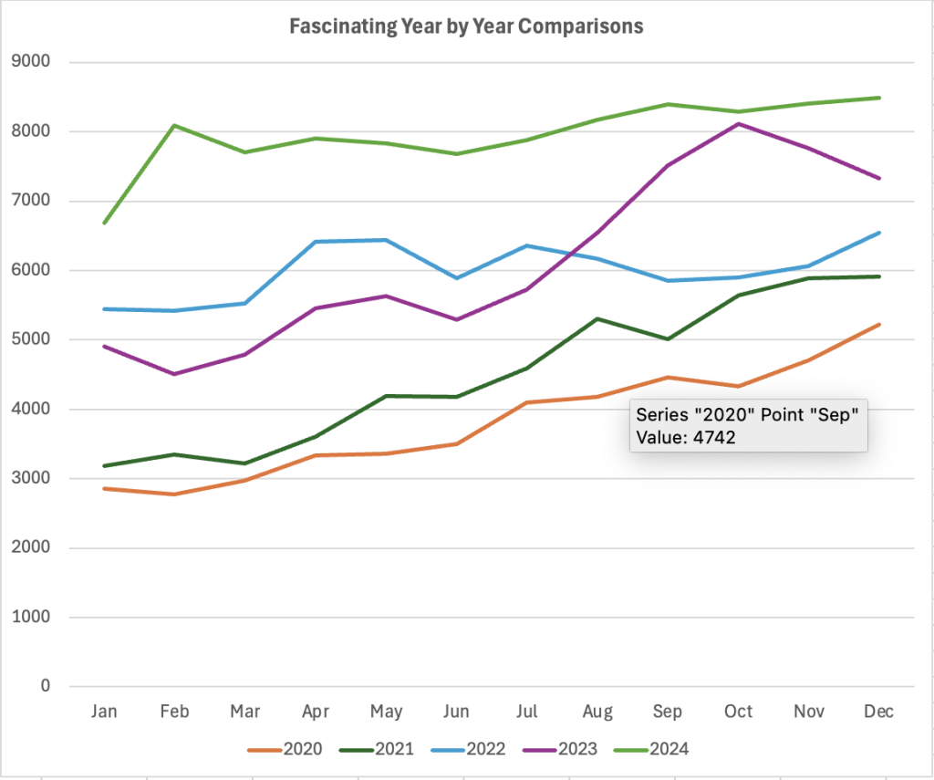
Have you ever seen a line chart that shows monthly revenues, or some other number, and compares this year to last year to the year before and so on?
You know, the one with lines the color of a gumball variety pack?

(This is a random dataset for illustration, so don’t look at it too closely.)
The chart of many colors is the default that Excel produces.
But if you want to use the chart, you’re going to have to keep going back to the legend to figure out which year is which color. Thus, the default gumball approach bakes in a usability problem.
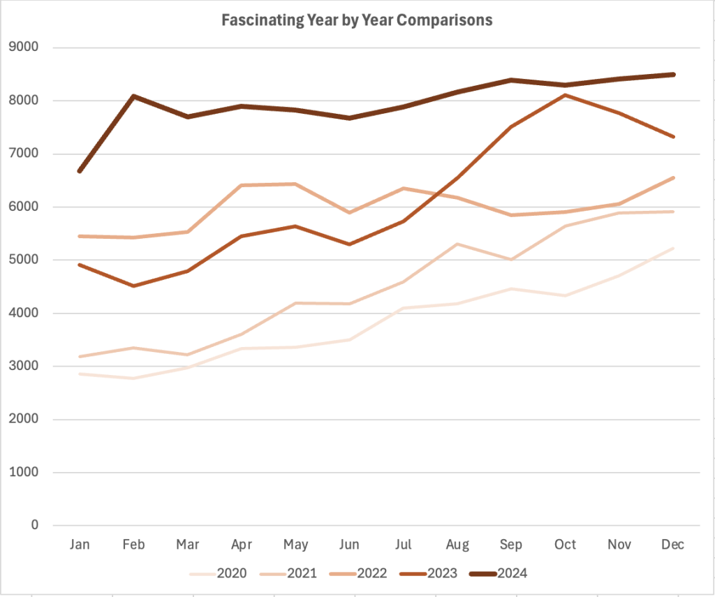
Instead, for a graph that compares the same data year over year, I like the metaphor that over time a thing fades and decays. In that way, the lines of a graph can be thickest and darkest in the most recent year and as the years go back, they can be a little thinner and tinted lighter.

This one is boring to look at, but you should be able to intuitively tell the chronological order of each line on the graph. You can see the data more easily now.
One benefit of showing years stacked like this is when seasonality matters for the data. Another is in telling the volume of change between multiple adjacent years, which you can hopefully correllate with business decisions that you could annotate on the chart.
Are you trying to show so many years that you run out of tints of the same color? I haven’t run into that, personally, because I end up realizing that I don’t need to see the entire history of that dataset. The last 4 or 5 years are enough — and if more are needed, this is probably not the graph for that data visualization job.
When should you use a different colors for the lines? When the lines show different data, like income, expense, and profit. I like green or black for income, red for expense, and blue for profit.
As an aside, I don’t think I came up with this tactic, but I can’t for the life of me think of where I saw it first. If you recognize the pattern and can source it, please do so in the comments.

One response to “Better Year Over Year Line Graphs Using Time as a Visual Metaphor”
I love this. For years I’ve spent countless hours perfecting my keys, meticulously picking colors and even different line treatments to separate years. Never again!